We’ve been having fun re-imagining posters- in this railway posters, mostly from the steam age.
We’ll start this collection with the most modern of the posters in terms of subject matter. Our Alfrere Banner typeface is employed in a poster inspired by the early days of the modern era on British Rail

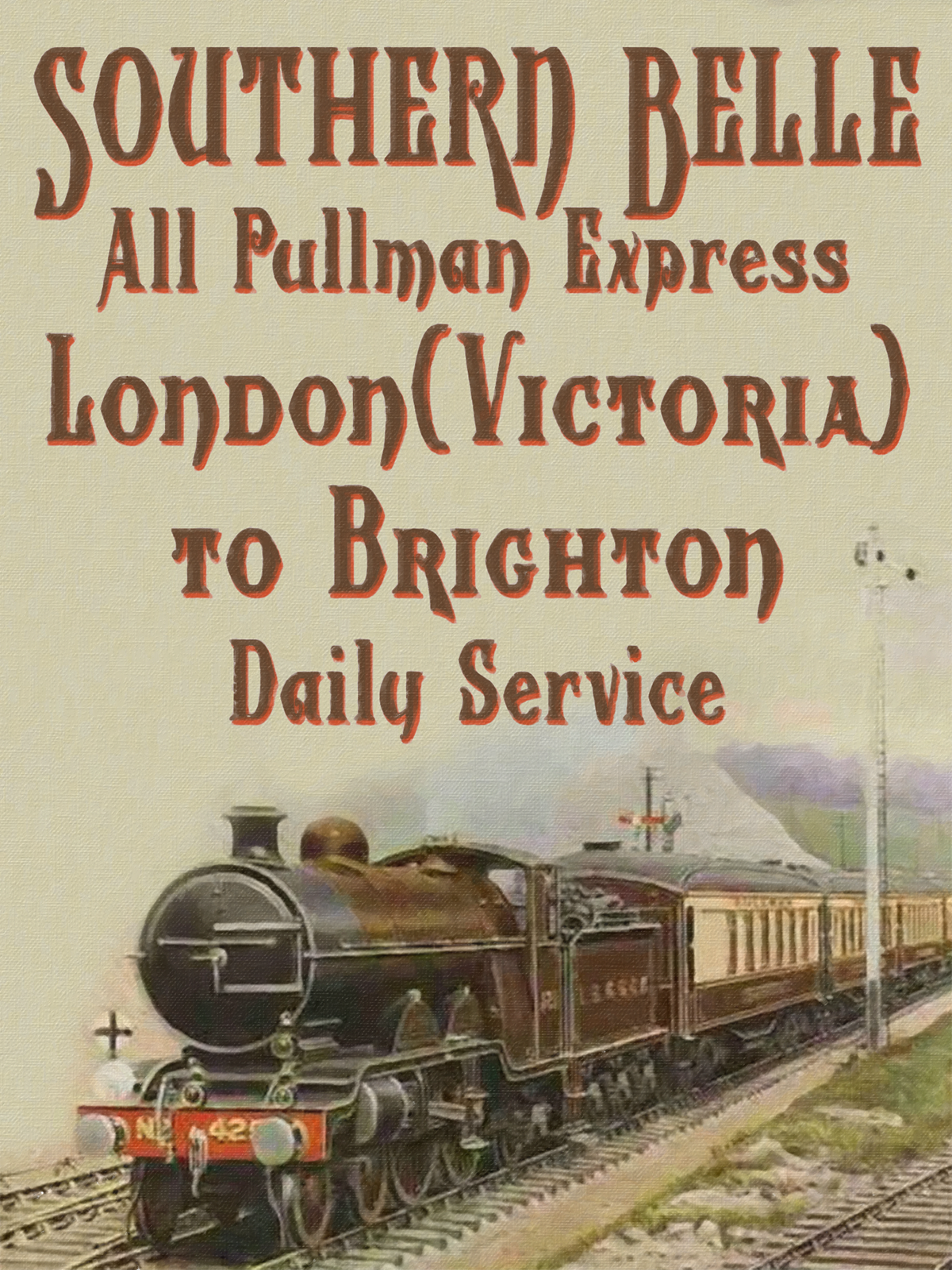
Still n the South Coast, the ‘Wolverhampton‘ typeface family – all three members of it – set off an illustration of the Southern Belle at speed.
Next we have the front cover of a Model Catalogue. The ‘Leeds ModelCompany” really existed, and very splendid their models were. This is one of the splendid “Princess” class express locos. This design uses the “Bettendorff” typeface.

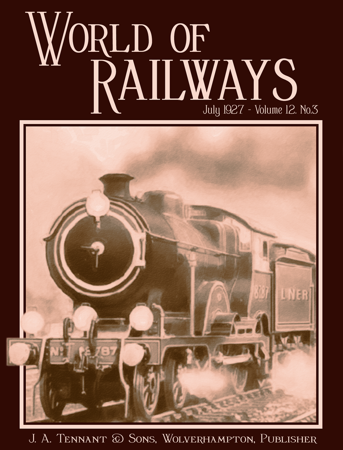
The next design is not strictly a poster, but a hypothetical Magazine Cover. An East Anglian express storms out of the pages of “World of Railways”… a product of our imagination, but not to worry… The typography employs the Bertoni typeface family.
The Haymer typeface family suits this late 30′s ‘Streamline Era’ poster very well. The Silver Jubilee express ran to Newcastle-on-Tyne from 1935, named in honour of George V’s Jubilee year, 1935.

Off to the South Coast now, with the Thurgoode typeface and the “Atlantic Coast Express” of the Southern Railway.


